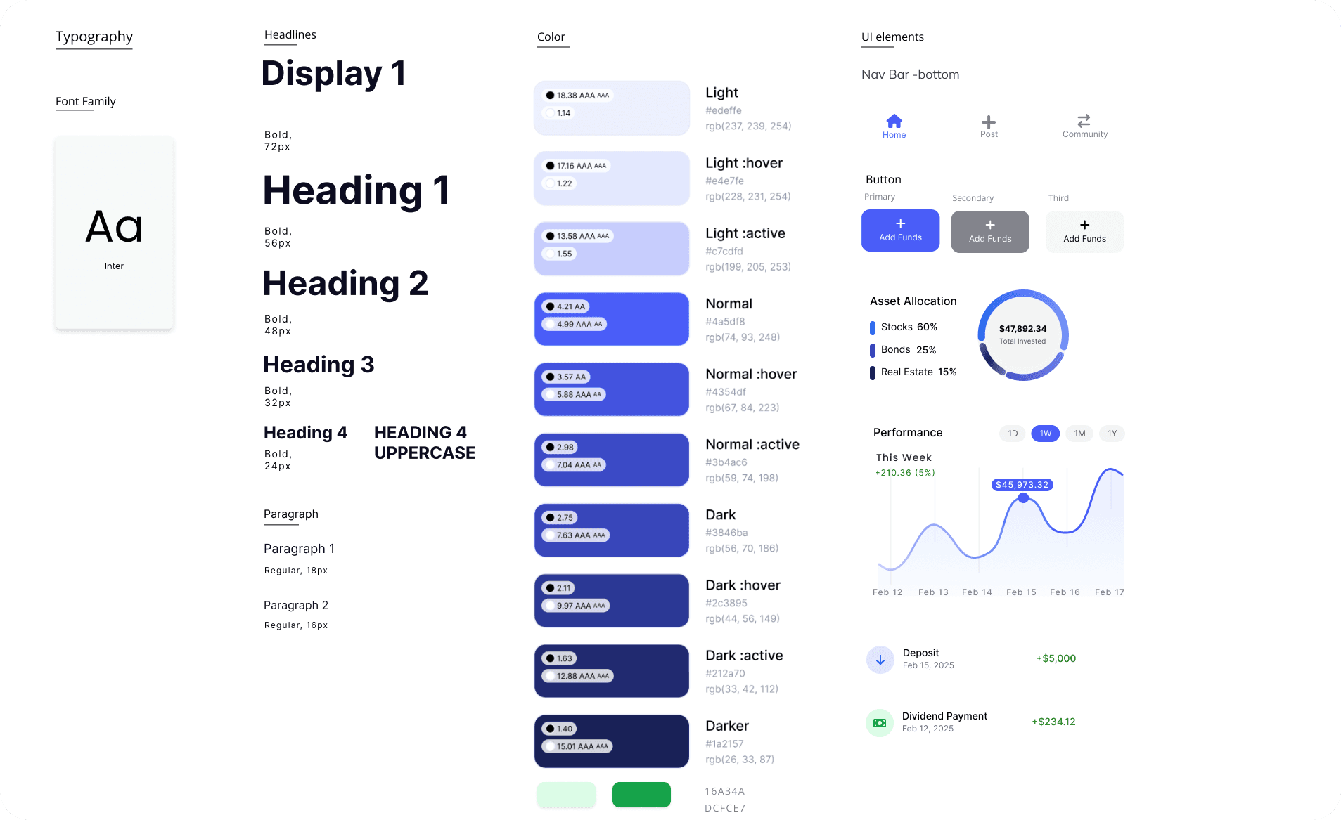
Redesigning the Blockhouse's
mobile homepage


From transactions to Stocks — explore every corner of the market with ease.

Redesigned the homepage of a portfolio management app to create an experience that is clearer, more usable, and more accessible. This redesign draws on my fintech research and previous internship experience, focusing on best practices in UI design, usability, and accessibility.

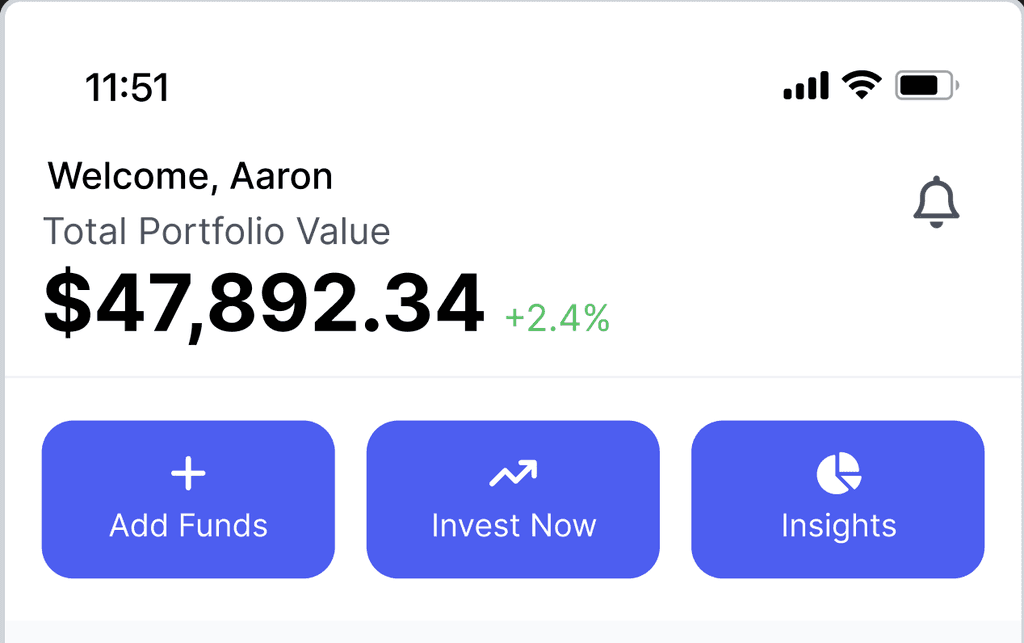
Call To Action
To encourage user interaction and streamline key tasks,I positioned CTA buttons near the top, ensuring users can quickly access important functions.
Call To Action
To encourage user interaction and streamline key tasks,I positioned CTA buttons near the top, ensuring users can quickly access important functions.
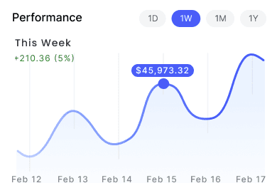
Real-Time Portfolio Insights
Integrating an interactive chart with time-range toggles, making it easy to switch views and interpret performance data at a glance for users wanting to track trends over various timeframes.
Real-Time Portfolio Insights
Integrating an interactive chart with time-range toggles, making it easy to switch views and interpret performance data at a glance for users wanting to track trends over various timeframes.
"I've been working on a new electronic cash system that's fully peer-to-peer, with no trusted third party. ”
— Satoshi Nakomoto

"I've been working on a new electronic cash system that's fully peer-to-peer, with no trusted third party. ”
— Satoshi Nakomoto


Recent Activity
Send and receive Bitcoin instantly with a user-friendly interface.
Recent Activity
Send and receive Bitcoin instantly with a user-friendly interface.
Accessibility Enhancements
WCAG AA Contrast
Readable Typography
Clear Hierarchy & Labeling
The new design offers a cleaner, more intuitive, and more inclusive user experience by addressing the old homepage's pain points and aligning with FinTech UX standards. Key portfolio metrics are front and center, calls to action are easy to find, and accessibility considerations ensure that all users can effectively manage their finances.

Original Homepage
Overwhelming Data Presentation: Multiple sections with dense information made it hard for users to grasp key data at a glance.
Limited Interactivity: Users could view general performance but had fewer options for time-range customization or interactive data exploration.
Navigation Complexity: The navigation bar included many icons and sections, creating a learning curve for new users.
Accessibility Gaps: Some color contrasts and text sizes did not meet WCAG AA standards, potentially affecting users with visual impairments.
Redesigning the Blockhouse's
mobile homepage


From transactions to Stocks — explore every corner of the market with ease.


Original Homepage
Key Observations & Pain Points:
Overwhelming Data Presentation: Multiple sections with dense information made it hard for users to grasp key data at a glance.
Limited Interactivity: Users could view general performance but had fewer options for time-range customization or interactive data exploration.
Navigation Complexity: The navigation bar included many icons and sections, creating a learning curve for new users.
Accessibility Gaps: Some color contrasts and text sizes did not meet WCAG AA standards, potentially affecting users with visual impairments.
Redesigned the homepage of a portfolio management app to create an experience that is clearer, more usable, and more accessible. This redesign draws on my fintech research and previous internship experience, focusing on best practices in UI design, usability, and accessibility.
Call to Action
To encourage user interaction and streamline key tasks,I positioned CTA buttons near the top, ensuring users can quickly access important functions.
Real-Time Portfolio Insights
Integrating an interactive chart with time range toggles, making it easy to switch views and interpret performance data at a glance for users wanting to track trends over various timeframes.
Recent Activity
This feature showcase recent deposits, dividends, and other activities to inform users of their financial status immediately. Providing transparency builds trust, letting users see transactions in real-time.
Asset Allocation
To meet users' needs to gain a quick understanding of their diversification, I designed a color-coded circular graph corresponding to labeled categories for easy scanning
Accessibility Enhancements
WCAG AA Contrast
Readable Typography
Clear Hierarchy & Labeling
The new design offers a cleaner, more intuitive, and more inclusive user experience by addressing the old homepage's pain points and aligning with FinTech UX standards. Key portfolio metrics are front and center, calls to action are easy to find, and accessibility considerations ensure that all users can effectively manage their finances.
